
Gorilla Experiment Builder
SaaS Platform Redesign

SNAP SHOT
Gorilla is an Education Saas used by undergraduate students and professionals alike.
While Gorilla felt on solid ground with their professional users, they found a disconnect with their largest user base of Undergraduate Students, and tasked our team with better situating these new users with their product.
ROLE
Project Manager, Product Designer
METHODS
Desk Research, Competitive/Comparative Analysis, Usability Testing, Prototyping, Heuristic Evaluation, User Interviews, Affinity Mapping, User Flow, Tree Testing, (Updated) Persona, User Journey
TOOLS
Figma, Optimal Workshop, Maze, Otter.ai, Adobe Creative Suite
CHALLENGE
Getting out of the users’ way
Gorilla is used by undergraduate students and professionals alike.
Gorilla felt on solid ground with their professional users
They found a disconnect with their largest user base of Undergraduate Students
They were unable to understand where the issues were coming from that their new users were experiences.

We narrowed our scope of work to a redesign of their Homepage and the Samples Page, which housed their most popular tools.
WHAT WE MADE
USER RESEARCH
Target User

User Interview Insights

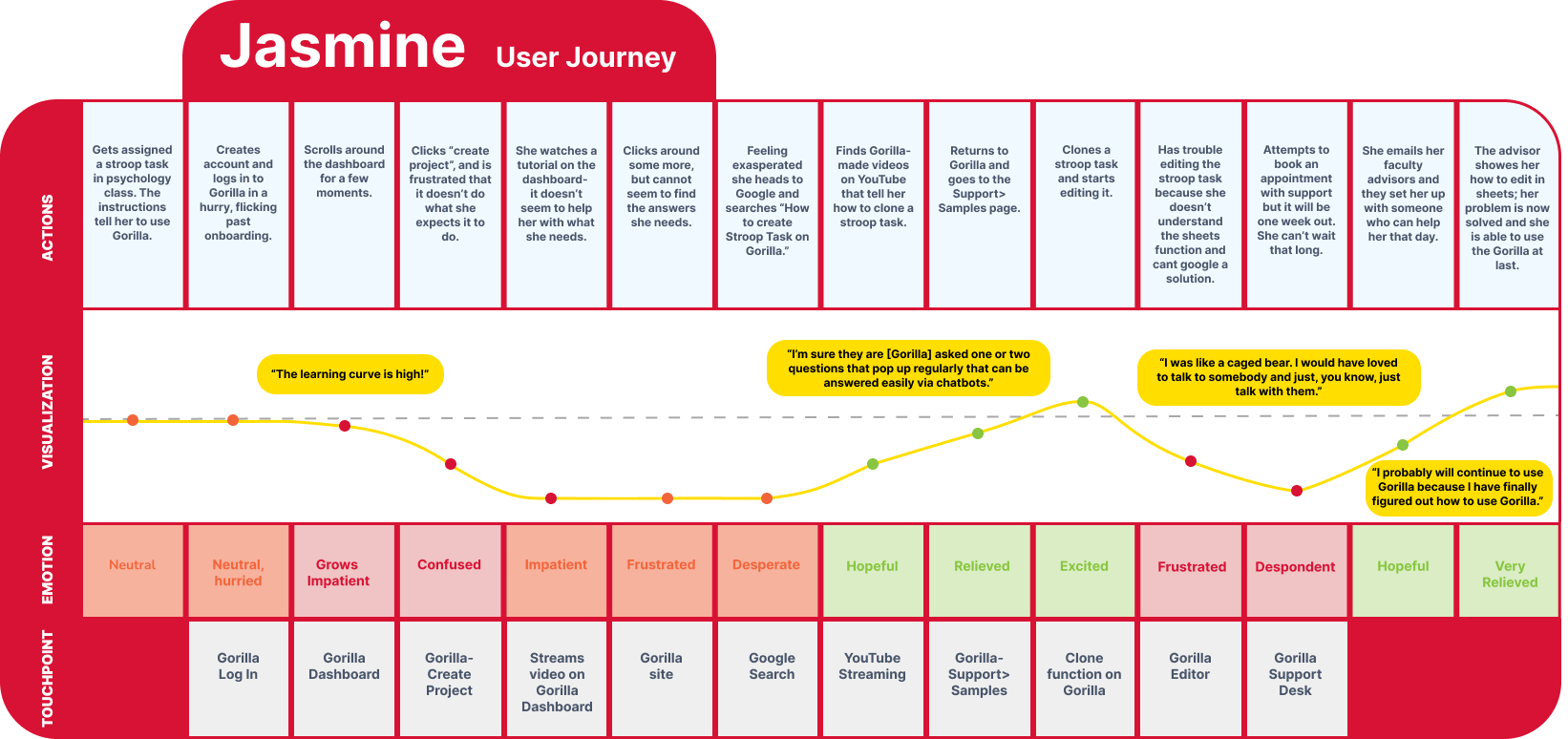
User Journey
User Flow
We also mapped out a baseline user flow of a popular task so we had another top-level illustration of the user flow to compare against once we had finished our redesign of the product.

Top Takeaways
Gorilla users said they had difficulty navigating the website overall. All users reported a high learning curve in the initial adoption of the tool due to inconsistent language and terminology used for common items and tasks, difficulty in searching and finding help materials on Gorilla’s website, and had difficulty navigating specific parts of the experiment user interface.
Gorilla users said they had difficulty searching and finding Gorilla’s support resources on their website. Users relied on outside sources, such as Google and YouTube, to find materials made by Gorilla or videos that live on the Gorilla website. Users also had trouble finding the pop-up help windows that explain the UI functionality.
Gorilla users had difficulty finding help for specific tasks in experiments for which there were no support videos and resources. Users expressed a desire for more targeted assistance when working on specific and personalized parts of their experiments.
“I spent a month and a half to figure out how to run the Gorilla experiment.”
“When I jump to the difficult task, the task becomes too difficult that these demos are no longer helpful.”
“I used Google to find my answers on Gorilla.”
PLATFORM REDESIGN
A Web Based Platform Experience
The existing landing page/ homepage was only used for news and a few haphazardly placed tutorials.
There was no differentiation or contrast between the containers of News/ Updates and the containers containing the tutorials.
Our major innovation that held sway over all else was the feel and ease of use of a platform.


Redesigned Platform Style Home Page
We also utilized the prominence of the homepage to give users direct access to the most popular tools and functions.
Original Home Page
NAVIGATION REDESIGN
Our Heuristic Evaluation found a major problem with findability. We designed a global side bar navigation that was very popular among comparative sites that utilized experiments, testing, and template based forms.

We added a much needed Search Bar as our research had found that users were leaving the site and using Google Search to find their answers to how best to utilize the tool.
TOOL FILTRATION
Tool Template Gallery

Our Comparative and Competitive Analysis showed that most similar platforms called their pre-made experiments Templates.
We renamed the pre-made Experiments section from “Samples Page” to Template Gallery.
In keeping with our User Interviews and Heuristic Evaluations of the site, we added a Filter Function to the exhaustive list of templates the tool had available for users.
More Projects


